The Misplaced Men’s Room: A Missed Opportunity in Retail Design
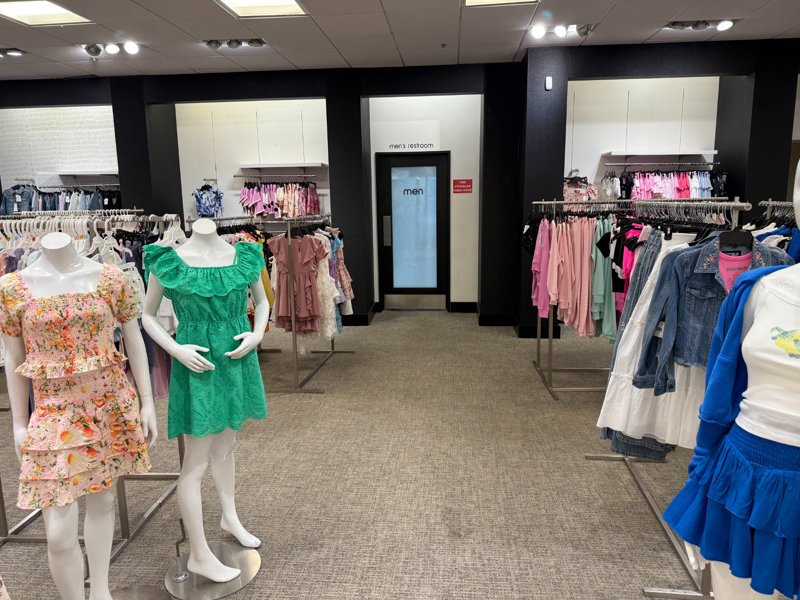
Picture this: you’re weaving through the crowded aisles of Bloomingdale’s, dodging displays and shoppers, only to discover the men’s restroom tucked beside the girls’ clothing section. It’s not just inconvenient; it’s a baffling choice that reeks of poor planning. As someone who studies marketing and consumer behavior, I can’t help but see this as a textbook case of squandered potential. Department stores are supposed to be masters of manipulation, guiding customers toward purchases with every step. Yet, here we are, with men forced to navigate a sea of sparkly dresses to reach a basic amenity. This isn’t just a user experience failure; it’s a missed chance to boost sales, a symptom of design and layout teams that seem to prioritize anything but revenue. Let’s dive into this retail blunder with a touch of cynicism for a blog post destined for Medium.
Retail is a psychological chess game. Every element, from the perfume gauntlet at the entrance to the candy bars at checkout, is designed to nudge consumers toward spending. So why would a store place the men’s restroom in a section as irrelevant to its users as girls’ clothing? It’s not just a logistical misstep; it’s a failure to understand the customer journey. Men, who often shop with purpose and spend less time browsing, are sent on a detour through a department that holds zero appeal. Meanwhile, the men’s clothing section, where they might actually pause to browse a jacket or tie, sits untouched across the store. It’s as if the layout team decided to prioritize confusion over profit.
This placement reflects a broader issue: design teams that seem disconnected from the goal of maximizing sales. Stores like Bloomingdale’s have the budget to hire top-tier consultants who obsess over lighting, signage, and flow. Yet, they churn out layouts that feel like afterthoughts. A strategically placed restroom could act as a subtle funnel, guiding men past racks of tailored suits or pricey watches, items they might actually buy. Instead, they’re routed through a section that offers nothing but awkward glances and a quick exit. Imagine a man waiting for a stall, idly noticing a display of leather belts or flannel shirts nearby. That’s a potential sale. Now picture him standing by a rack of girls’ leggings. No sale. No interest. Just a beeline back to the parking lot.
The cynicism kicks in when you realize this isn’t a one-off mistake but a pattern across department stores. Layout teams seem to operate in a bubble, more concerned with aesthetics or operational shortcuts than driving revenue. Maybe it’s cheaper to plumb restrooms in a far corner, or perhaps they’re chasing some trendy design award. Whatever the reason, they’re ignoring basic consumer behavior. Data shows men spend less time in department stores than women, with shorter shopping trips and more goal-oriented habits. A 2019 study in the Journal of Retailing found that smart store layouts can boost impulse purchases by up to 15 percent. For a chain like Bloomingdale’s, that’s millions in potential revenue. Yet, men’s restrooms remain exiled to irrelevant corners, ensuring no accidental browsing happens.
This isn’t rocket science. Retailers have the tools and data to make smarter choices, yet many don’t. Some, like Nordstrom, get it right by placing restrooms near high-margin departments, encouraging serendipitous purchases. But they’re outliers. Most stores seem content with layouts that frustrate rather than facilitate. A restroom in the men’s section isn’t just about convenience; it’s about creating a captive audience. Men waiting in line might notice a sharp blazer or a discounted tie, turning a mundane trip into a sale. Instead, stores serve up detours that scream indifference, practically begging customers to leave empty-handed. It’s a small but telling example of how retail design can fail to align with the ultimate goal: getting the right products in front of the right people.